I love Netflix, it is my “go-to” when it comes to streaming shows/movies even with competition services like Disney+ and Amazon Prime. However, I have always felt it could be better, purely because browsing experiences on the app feel inundated. I wondered if others experienced this and if so, how can the app be improved? Let’s explore this…
Context
Netflix is the most used streaming app for Entertainment Media with 182 Million users since being founded in 1997. Now, with ever-growing content, users are overwhelmed by viewing choices and searching for specific content has become more difficult in experience. The recent pandemic has also enlisted more users and behaviours emphasising Netflix as the leading provider of entertainment streaming, and placing more importance on app experiences.
Problem
From the data and user interviews performed, the main problem lies within the time taken to search for specific content, in addition to accessing newer or alternative content outside the user’s previous viewing choice ( controlled by Netflix algorithm)
"..you end up scrolling for something to watch for half and hour even before you click and watch something"Case Study Participant
" The average adult takes 7.4 minutes to make a selection on a streaming service. Adults 18-34 take 9.4 minutes, while 35-54's need 8.4 minutes.Viewers 50 and older abandon discovery after 5 minutes and just dive into something"deadline.com
My Goal
I have decided my objective is to improve the current UX/UI of the searching experience by introducing efficient filtered searching and easily accessible curated content for the user.
Processes
Qualitative Research, UX Design, Visual Design, Prototyping and Testing
Tools
Adobe Illustrator, Figma
DISCOVER
User Interviews
I used the DBAG (Demographics, Behaviours, Attitude, Goals) structure for user interviews. I asked questions concise to searching and the browsing experience.
Each Interview took no longer than 10-15 mins and in a casual setting to allow the interviewees to reveal their thoughts and opinions for each question asked.
- What TV Stream application do you use and on what device do you use it with?
- Where do you stream your TV programs mostly? Is the internet readily available?
- How often would you like/save your intended programs to watch?
- Can you describe your searching experiences for your like/saved programs? Are your searching choices based on mood, if so please describe?
- What are some negative and positive experiences you have had whilst searching for liked/saved programs?
- Describe what you would like to see improved or to further enhance your TV program searching experience (liked /saved programs) and why?
DEFINE
User Journey Maps
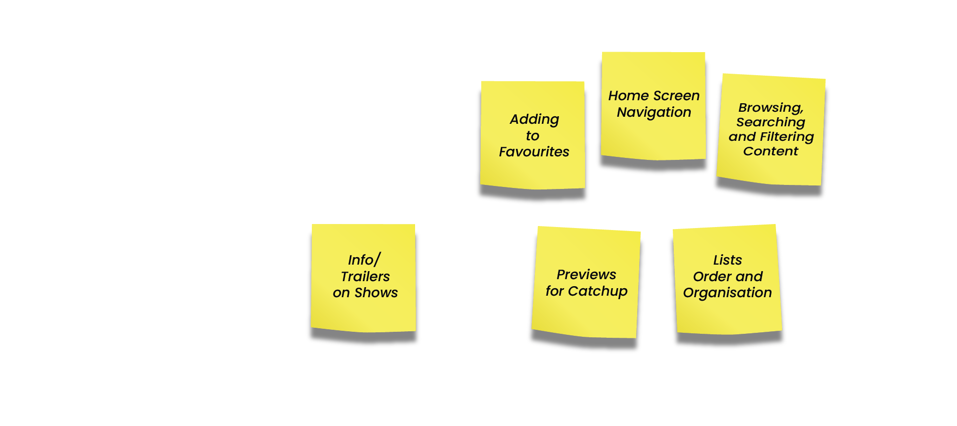
From the interviews, I found all answers revealed similar and different experiences when using Netflix or any other streaming app. The common experiences outline feelings throughout the searching and browsing journey as initially thought. I collated all answers and created a User Journey Map to help identify and ideate on key opportunity areas.
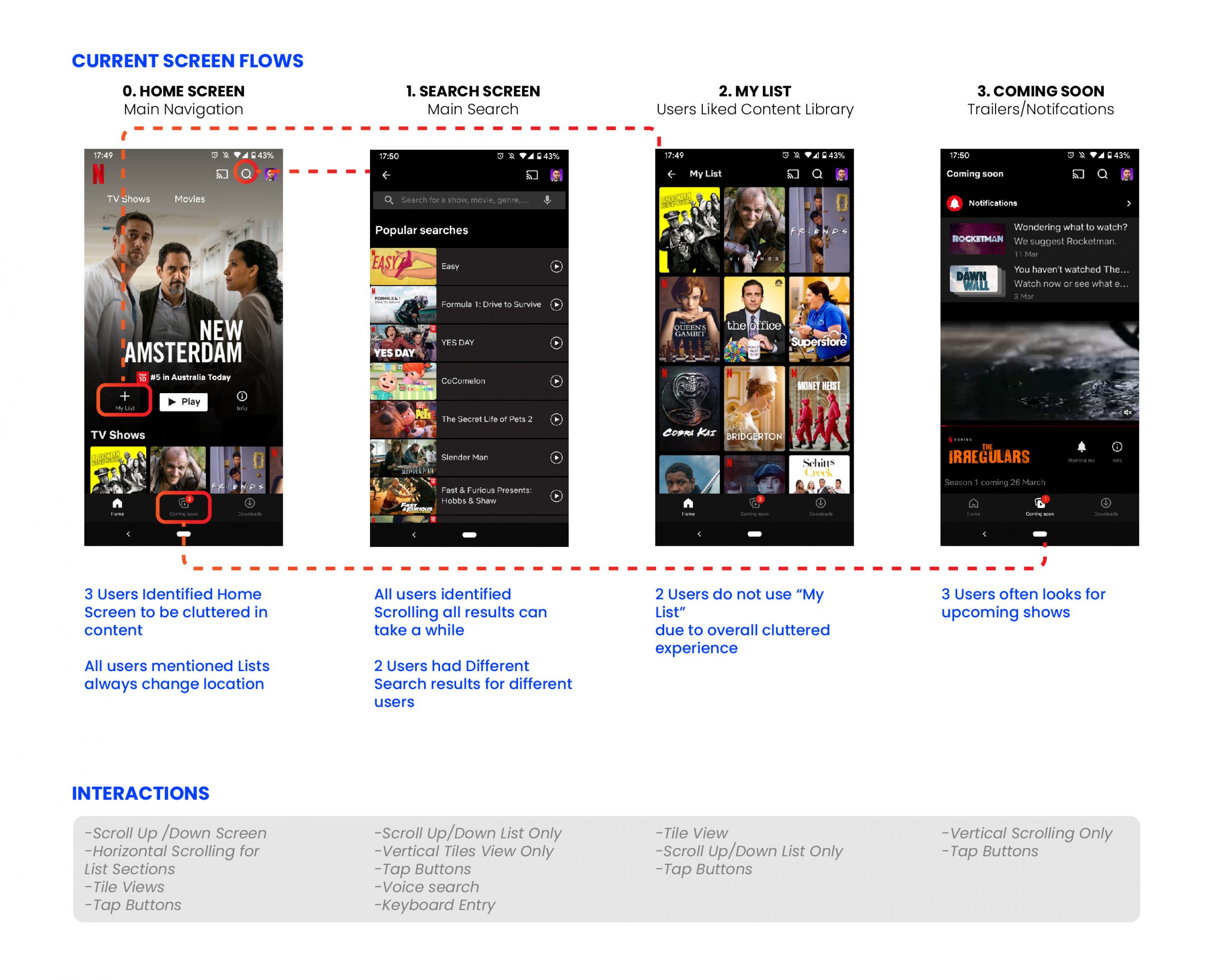
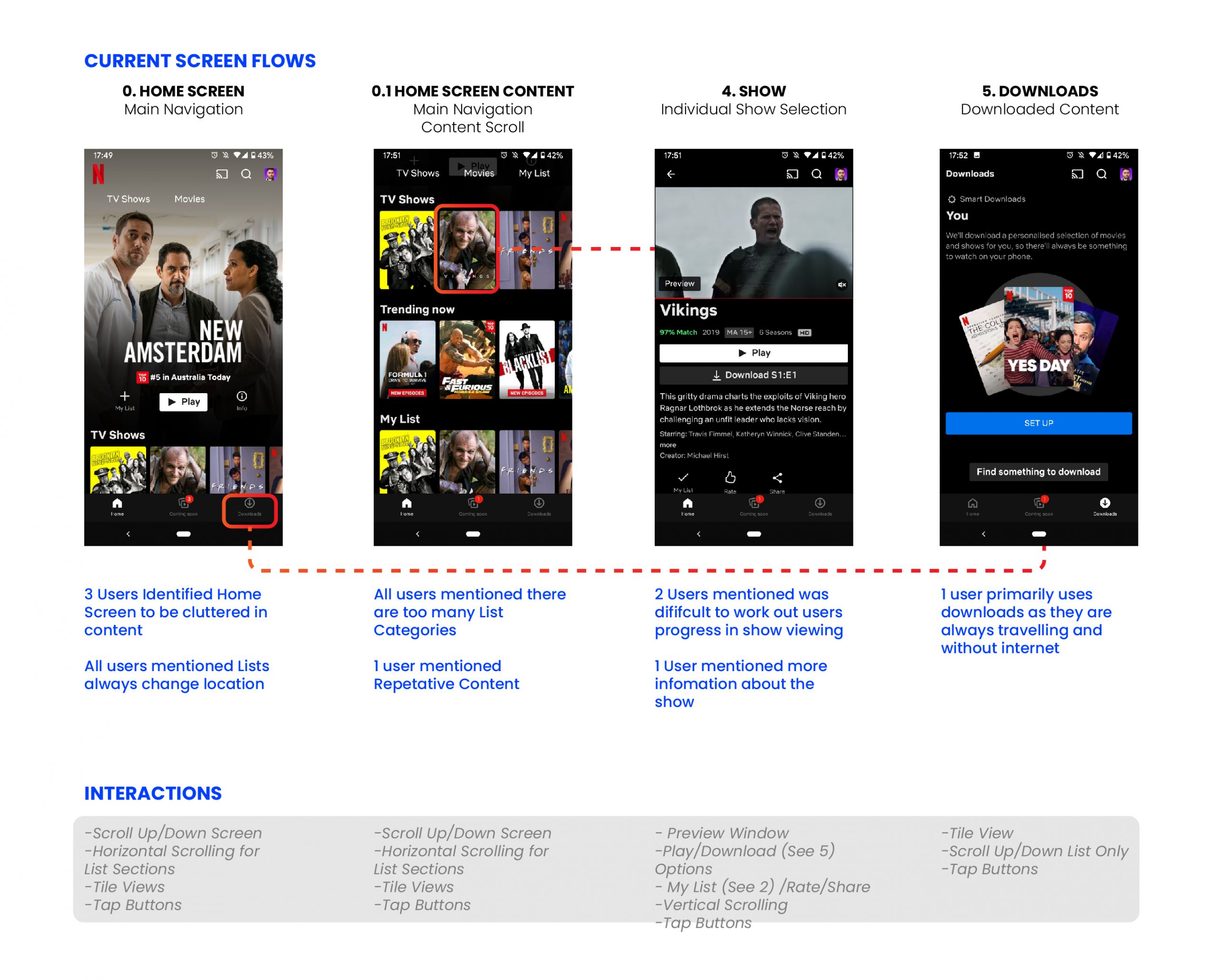
Current User Flows
I developed the current user flow and interactions with screenshots from the current Netflix app. This will help in reference to user experiences and highlight the necessary components for ideation and prototyping.
Key Findings and Opportunities
Enhanced Search Filters
Better Iconography
Information to suggest New / Popular / Upcoming
Indicate progress of “ series viewing ”
Recap snippet of last played as catch-up or reminder
Users current viewing options at the top of the navigation scroll
Integrate filterable searching
Nostalgic Viewer Options (Maybe options to filter when searching)
Job Stories
To help prioritise pain points and opportunities, I have developed some JTBD Framework questions in the viewpoints of the personas
“When I have been recommended a show by my friends, I want to find it easily and watch, so I can enjoy the experience, social connection and
discussions with my friends afterwards”
“When I have spare time, I want to binge watch interesting shows from my saved lists, so I can be entertained and relaxed”
“When I come home and I am anxious from work, I want to find a show that will help to change my mood, so I can feel more positive and enjoy
the rest of my day ”
“When I have not watched a show for a while, I want to be reminded of my previous viewing, so I can easily resume from where I was up to ”
Priority Matrix [2×2]
I found myself going into “The Matrix” from the research and job stories. This helped decipher the priority of opportunity areas that are beneficial to the users as well as Netflix.
How Might We?
I prioritised the solutions (compared to the user journey map) using HMW Statements.
1) How might we simply guide users to what they are looking for?

A. Have very minimal tiled screen based on users current/my lists/ suggested viewings / global search tab for more expanded view for finding content
B. Bigger spaces between list and sticky widgets (always at top) for users current/mylists/ suggested?
C. Onboard style menu each time users log on (i.e search / mood / go to current viewing etc)
2) How might we allow users to be specific in their search?

A. #tag field for user to type words
B. Filter Button to expand clickable filters
C. Search within categories from lists
D. Results from search to have limit – numbered pages/arrows to view more results (like Google)?
3) How might we remind users of their content viewing?
A. Progress bar and timestamps
B. Hover over content tile to preview a clip of where user was up to
C. Catch-up button that reveals episode trailer
Pop-ups with dismiss button when they log into App again
D. Notifications to user that is a reminder to where they were up to in notifications as well as emails sent to user
DEVELOP
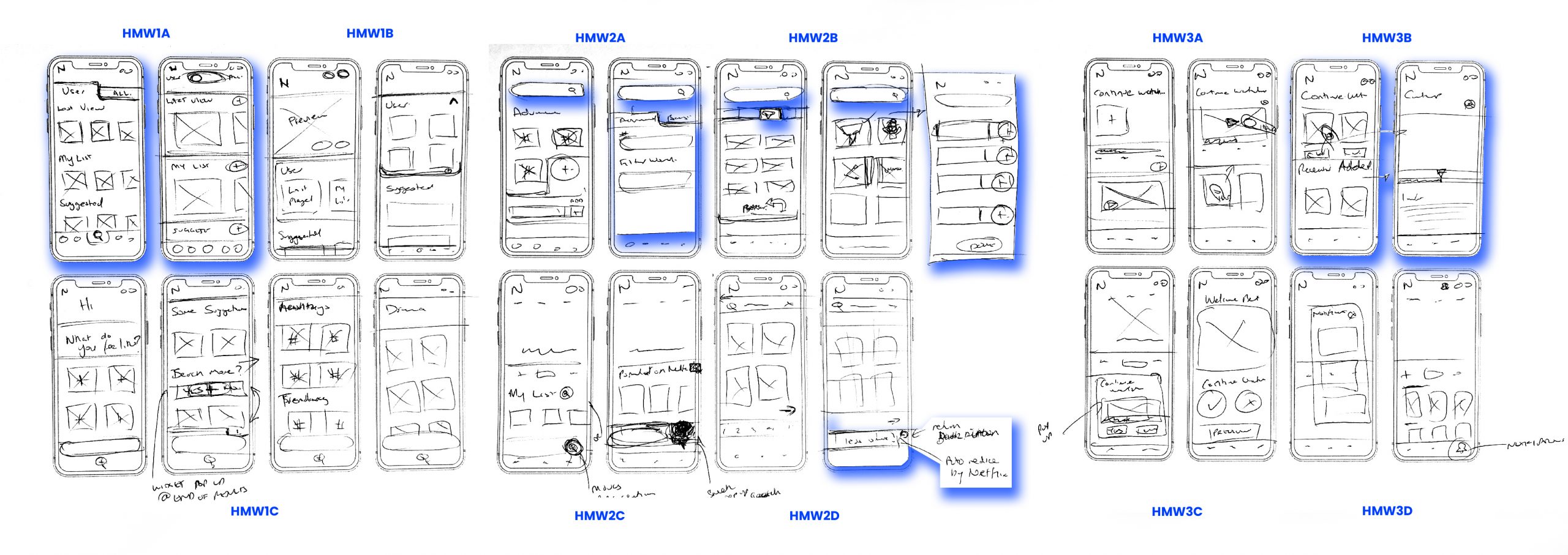
Crazy 8 UI Wireframe Sketches
I went all Crazy 8 to quickly explore each solution’s look, feel and functions. The ideas I have chosen to develop are best suited to the priority matrix and HMW
DELIVER
Mid Fidelity Prototype
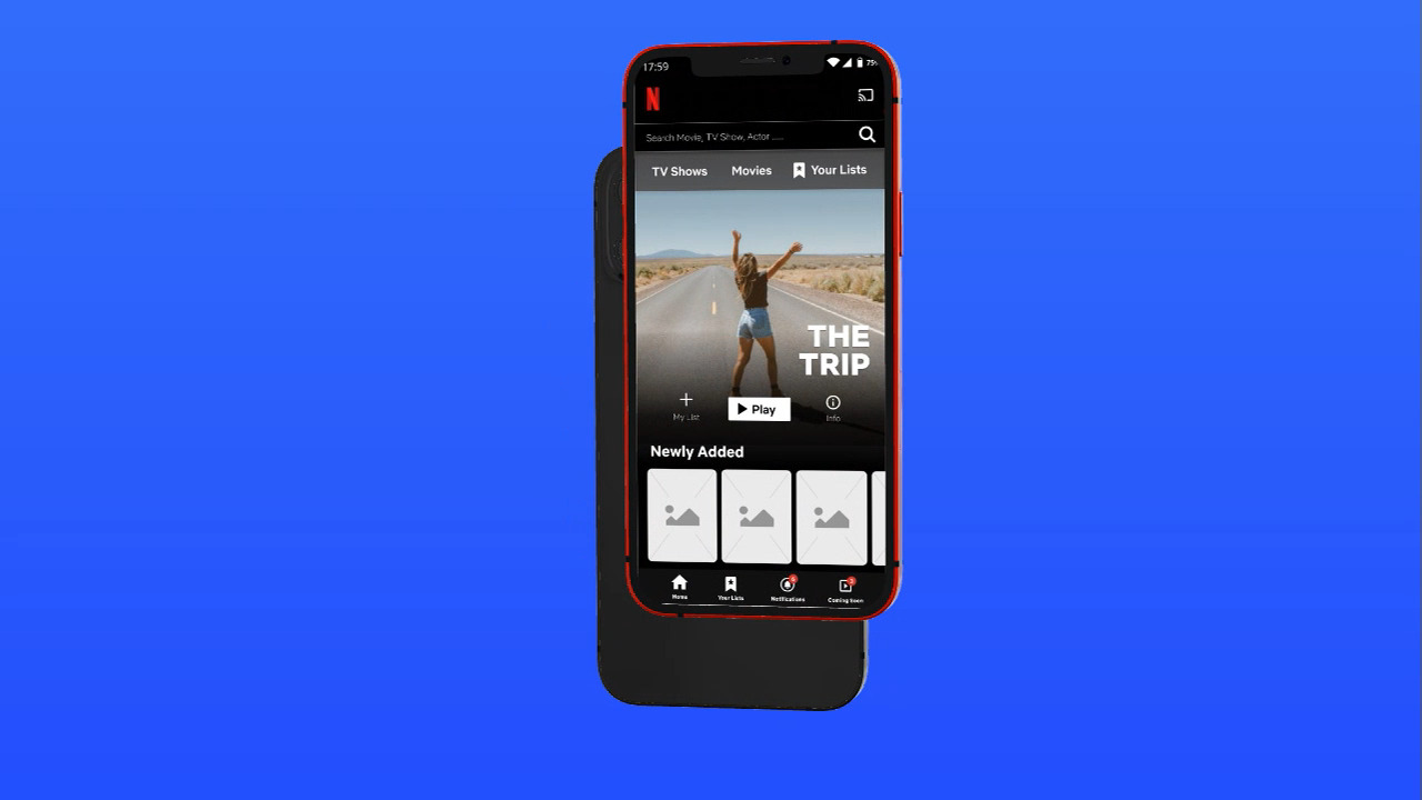
With Figma, I recreated the current Netflix Mobile application with the components from the top Crazy 8 sketches. Considering I am testing for certain interactions based on browsing and search filters, I decided the prototype to be Mid-Fidelity quality. This will help in the automatic understanding of the user within the Netflix app environment and allow the user to focus on the new interactions testing for this case study.
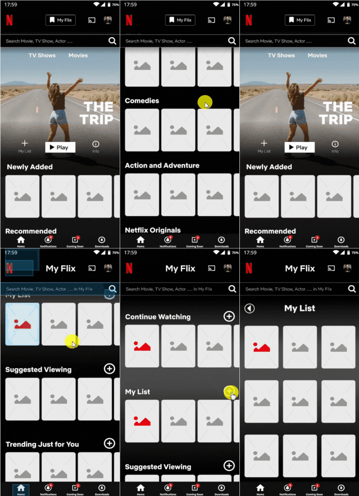
Navigating the home page with My Flix button added for quick navigation to users listed programs. Search bar always present for quick access.

Using advanced search filters to help narrow down the user’s search results and improve search times
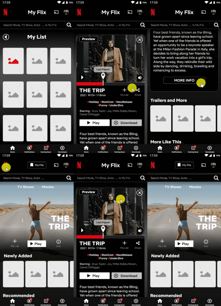
Quick preview of the program and more program information with easy return navigation to home
Usability Testing
I recruited 5 people to test the initial prototype. The participants were aged between 25 – 30yrs, all familiar with Netflix.
The objective of the test was:
- How easily users are able to find the user home page
- How easily users are able to find more content within a list
- How easily users are to user-filtered search
- How easily users are able to preview content to see the progress of viewing
- How easily users are able to discover more information about a chosen content
- How does the overall experience feel like
- What improvements need to be made
1st Round Test Results
- 4/5 were able to find the user home page
- 2/5 were able to find more content within a list
- 3/5 users were able to use filtered search
- 5/5 were able to preview content to see the progress of viewing
- 5/5 were able to discover more information about a chosen content
Most users found the new interactions or specific curated pages and filtered search helped in quickly navigating to users saved content and desired content.
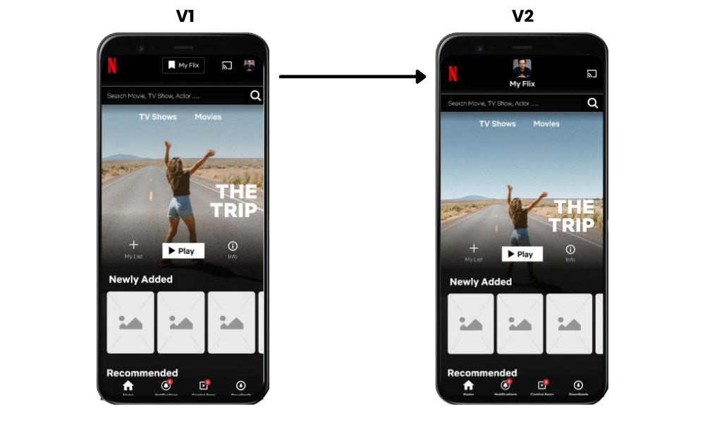
Users also noted initial confusion in finding the button to navigate to the user’s curated homepage (My Flix button with Bookmark Symbol), once this was learned the user found it an easy and quick function to use. Users mentioned the appearance of the button should be more distinguished with the use of a viewer profile image as an example.
2nd Round Test Results
- 1/3 were able to find the user home page
- 2/3 were able to find more content within a list
- 2/3 of users were able to use filtered search
- 3/3 were able to preview content to see the progress of viewing
- 3/3 were able to discover more information about a chosen content
As with the first iteration test, most users found the new interactions helped in quickly navigating to user-curated and saved content experience. However, this outcome was without setback and initially was confusing for the user to find. The new iteration of the MyFlix button proved more confusing as users noted they thought it was to “switch viewer profile” not as the button to their curated home page (2/3 users)
1 user noted some confusion in the terminology of the filtered search title bar in reference to the results displayed.
The data shows the second iteration has a higher result in task completions but also with a higher error rate. I have noticed in testing, that errors were mostly going through a different route to end up with the targeted outcome and thus; proves that the success from the second iteration of the prototype closer to an MVP Netflix can benefit.
I decided to make a 3rd iteration of the prototype from tests performed to help illustrate my key findings and for any future development in this area of the app. The 3rd iteration amendments include:

My Flix changed to “Your Lists” and is part of the main top header categories
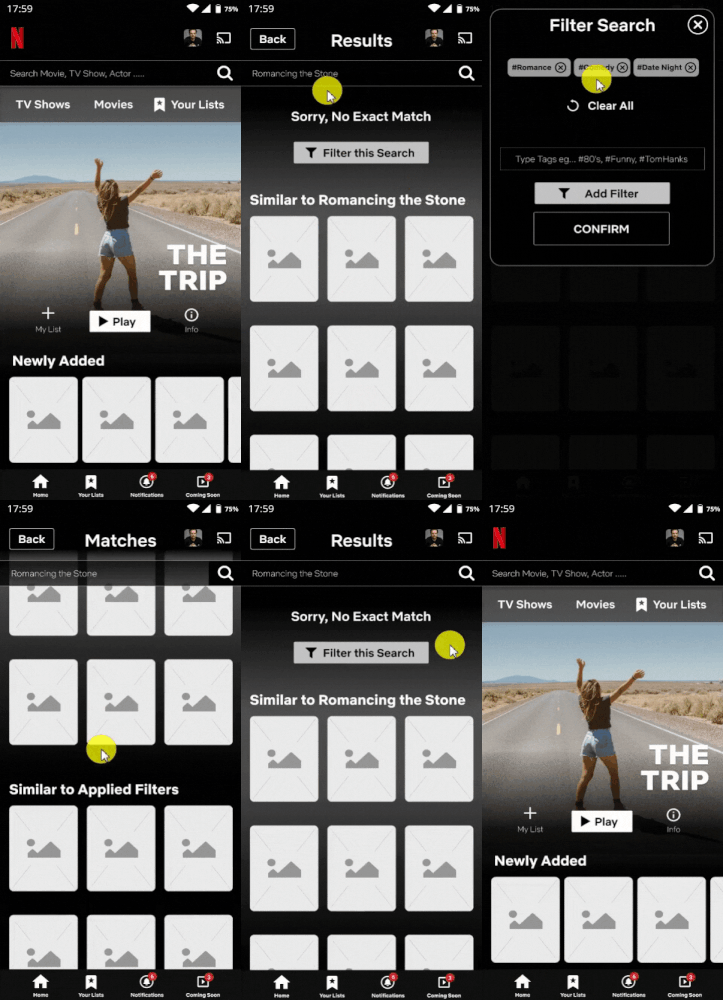
Terminology changes for filter options buttons. Colour changes to buttons
KEY LEARNINGS
Project Outcomes
The key learning from this UX Case Study is the challenge of introducing new behaviours within an existing and widely used app.
The immediate impact included the instant access to search where interviewees noted it was “very easy” to find and use the feature.
The decision to create a user-curated page/screen for content proved successful with quick navigation and removing pain points from the browsing and the searching experience. However, from the tests, it took interviewees “a little getting used to” before it became an efficient feature. In addition to learning new features, the terminology used such as “My Flix” needed to be modified for the interviewees to instantly recognise and familiarise themselves.
With this being said, the overall feedback proved the new integrations enhanced and gave more functionality to the user. Tests showed how interviewees quickly searched, navigated and found the content to watch within a period that did not deter them from using the app altogether (as noted from the pain points).
I believe further development is required if this is to be properly implemented in the real world. For example, Card Sorting and A/B Testing for terminology; Heat-map tests are required to help with optimal button layouts and behaviour, especially with new button features; and finally, test scenarios to accurately record response times for searching, browsing and choosing content to prove its efficiency.
Netflix is a great entertainment streaming app and has an influence on many people’s lives regarding on-demand streaming. It has become a friendly comfort for a large population of people’s lives, daily behaviours and psychology. Thus, any improvements made to the app transcend from “Netflix and Chill” to “Netflix and Feelgood”.
UPDATE 2021
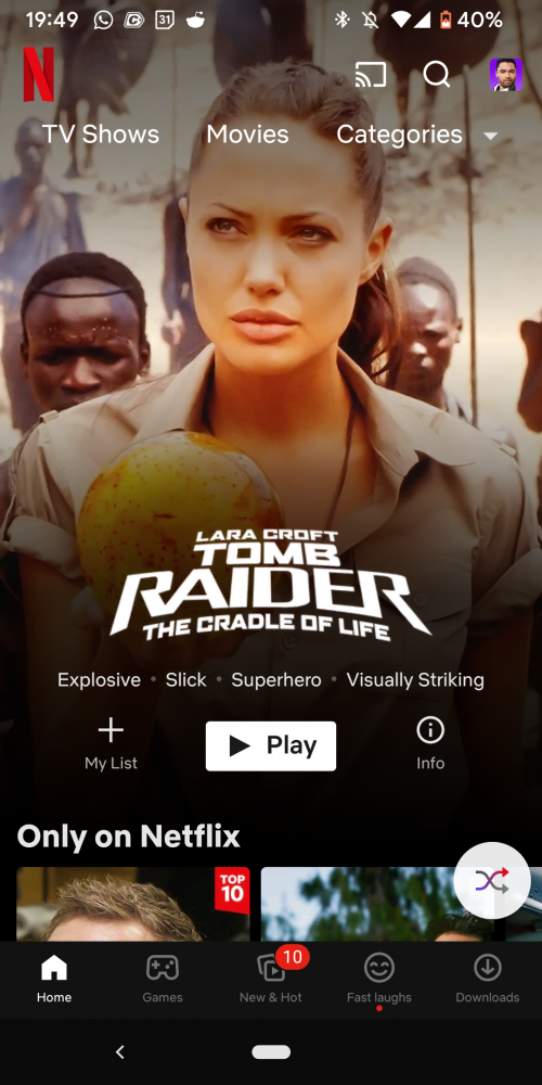
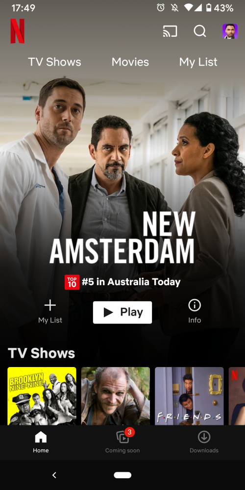
Since conducting the Case Study in early 2021, shortly after Netflix updated their app to have a “My List” quick access button in their top menu.
I guess my Case Study was on the right track proven by the user data!
UPDATE 2022
Netflix has updated its app, and “My List” has become under “Categories”. Once the user clicks categories, the list is revealed to show “My List “.
“Watch this space!”
