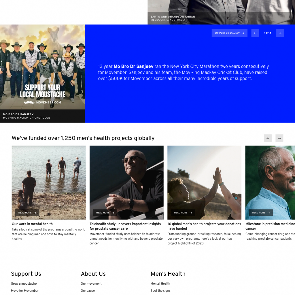
The Distinguished Gentleman’s Ride was founded in Sydney, Australia, by Mark Hawwa. It was inspired by a photo of TV Show Mad Men’s Don Draper astride a classic bike and wearing his finest suit. Mark decided a themed ride would be a great way of connecting niche motorcycle enthusiasts and communities while raising funds to support the men in our lives. The event in association with Movember, takes place 107 countries, has raised 31.5 Million US Dollars, and involves 340,000 participants.
Context and Problem
The website is consistently in one page format, making it easy for any person interested or participating to engage in the event. However, at the time of this project the TDGR website did not reflect the overall look, feel and interactivity in respect for this event. So I decided to take this ride ….
My Goal
My objective was to redesign proposal to the current UX/UI design through static webpage using HTML5 and CSS3
My Role
Online Research, Web Development and Designer
Tools
Adobe Illustrator, Adobe Photoshop, Adobe Dreamweaver
CODE
Static HTML
As this was a proposal project, PHP elements (i.e Shop, Leaderboard, Formfill ) were not required until implemented live. JS was only used for hamburger menu and lightbox functions. Using CSS styling parameters, I added effects and movement to static objects when hovered over.
KEY LEARNINGS
Project Outcomes
The key learning from this project is that a simple coded one-page static website can be just as interactive as a multi-page website with all the bells and whistles! I had fun designing and coding this site due to the themed (dapper style) element of the cause and the existing material to draw inspiration from. Some additional learning into JS is required for full working nature of the shop and leader-board sections. Stacking design layout works well with the flow and ease of the site. The stacked layouts was not to difficult to code in all responsive modes (Desktop/Tablet/Phone). Additional improvements with images, animations and colours could be made to be more inclusive to all genders for the site, and ultimately the cause .
This project was “mo”st certainly awesome to undertake, and look forward to the next one!


