A good balance of health, fitness, and well-being is always challenging. As we become more knowledgeable in these areas, the reliance on well-rounded and informed apps is significant to assist people in achieving their goals and balance in life. I decided to create a new MVP prototype based on the inconsistencies of the top existing apps available that are not currently “exercised” well in the market.
The key focus is to improve the delivery and interaction of large amounts of content across the different health, fitness and well-being categories.
Context
The Health and Fitness app market is large, citing 350, 000 apps available. In 2021, the top 5 Fitness apps catered to demographics with specific goals and needs, however, only a handful of the top apps have a holistic UX experience.
Problem
From the data and user interviews performed on 7 users, the main problem lies within the time taken to browse, navigate and find content through the different category content of the apps, user library, and activity settings to create a holistic experience.
"If you go through 10 different steps to get there, you've lost that motivation"User Participant
My Goal
My goal is to develop a prototype for seamless navigation, searching and content interactions. I believe this to be essential for an enhanced holistic experience for the user.
Processes
Qualitative Research, UX Design, Visual Design, MVP Prototyping and Testing
Tools
Figma, Adobe Illustrator
Solution
The result is an MVP, I named Fit-topia, combining the words “Fitness” and “Utopia”, to represent a holistic (body, mind, soul, diet) emphasis on health, fitness and well-being apps.
The prototype is based on the existing format of H&F apps with the inclusion of an adaptive main navigation button to centralize and nest interaction between the different categories of the app.
The idea is to allow the user to quickly flow among the different sections and categories whilst leaving more screen space for larger content layout and scrolling.
Secondary improvements include large modified visual menus for subcategories and Horizontal / Vertical scrolling for main pages.
DISCOVER
User Interviews
7 users were interviewed between the ages of 35-44 using DBAG questions and resulting in the creation of 2 personas that represented users who prefer a large range of health and fitness information (Focused Exerciser), as opposed to users who prefer to be socially active (Social Exerciser) and prefer simplified information feedback
- What TV Stream application do you use and on what device do you use it with?
- Where do you stream your TV programs mostly? Is the internet readily available?
- How often would you like/save your intended programs to watch?
- Can you describe your searching experiences for your like/saved programs? Are your searching choices based on mood, if so please describe?
- What are some negative and positive experiences you have had whilst searching for liked/saved programs?
- Describe what you would like to see improved or to further enhance your TV program searching experience (liked /saved programs) and why?
DEFINE
User Journey Maps
User journey maps helped identify the main pain point that is: a clearer and easier navigation to different content, options, and user library
Personas
Based on the research, two personas emerged
Persona 01 –Focused Exerciser
Is precise in their methodology. They prefer being active in one environment and prefer large information feedback to better themselves.
Persona 02 – Social Exerciser
Loves outdoor activities and experiences, especially if social. They prefer simple-to-use apps and love quick info bytes.
Current App Analysis
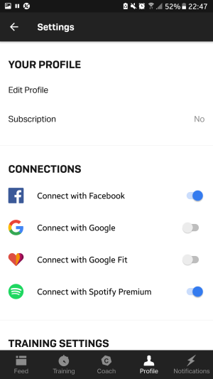
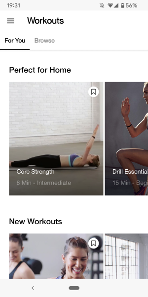
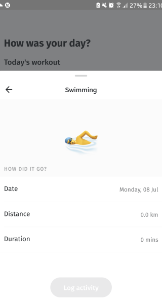
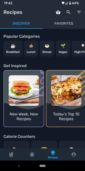
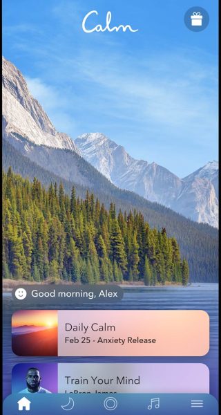
Comparisons were made on top performing holistic-based apps in the market; Nike Training Club, 8 Fit, Freeletics, Yazio and Calm. Key features and heuristics are:
– Nicely spaced out medium to large scrollable tiles
-Horizontal and vertical scrolling
-Easy to locate user settings menu
and library of content
– Bottom and top global navigation
(1 app sticky)
– Use of HQ imagery and Illustrations
– Average 7 levels of navigation hierarchyFreeletics
Nike Training Club
8 Fit
Yazio
Calm
Dribbble Trend Analysis
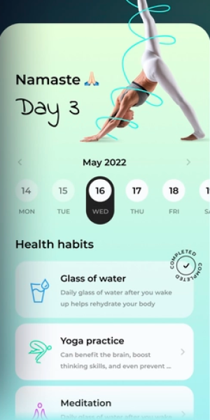
Comparisons were made with some ideas from Dribbble users offering some features to consider for the prototype and ultimately help in creating a basic design system.
– Adequately spaced out medium to large scrollable graphic/info tiles
-Horizontal and vertical scrolling
-Fonts, Colours, and Graphics to represent Look, feel, and experience
– Bottom navigation
– Use of Illustrations and Iconography
– Customisation of the home page
Layout, Spacing, Graphics, Colours

Layout, Info Tiles, Colours, Iconography

Colours, Soft edges, Iconography
DEVELOP
Solution Architecture
I decided to create a main navigation user flow chart on FIGMA to map out and help distinguish landing pages and how the user can quickly return to the home page / in between different categories.
The solution has the user flow experience applied to all similar functioned areas for browsing, choosing, and library. An example is; browsing for an exercise under the activity section will have the same user flow as finding a recipe under the nutrition section.
Singular Sticky Nav Button
Based on the site map and user flow charts, I adopted a lean horizontal stack hierarchy under a single “adaptable” centred nav button. The reason is to guide the user from a singular starting point, and then explore the options they require when they use the app. As a result, I retained an average 7-level navigation hierarchy as there is more content to navigate.

Sitemap Example of minimal horizontal / vertical inclined stacked hierarchy.
DELIVER
Mid-Fidelity Prototype and Design System
Using FIGMA, I started modelling the home landing pages for the three main areas of the app, ACTIVITIES / WELLNESS / NUTRITION. Whilst listening to some music on Spotify as my motivation, I did rough layouts with some colour to correct the look, feel, and spacing, so I can use these as templates to create the rest of the wireframes. I used screenshots of some DRIBBBLE examples to help with proportioning and tile layout formations, ultimately creating a simple design system.
Next on my list was to create all the navigation, modals, and interactions for the navigation the main areas of the app. This includes:
– Pop Up Selection Modals
– Choosing Buttons / Confirmation Buttons
– Choosing Items
– Return Home navigation loops
Below are the result layouts required for the mid-fidelity prototype
Quick Testing
I grabbed a few friends to quickly test the app flow and validate the Mid-Fidelity Prototype.
The primary areas tested were:
- Browse User Progress (Test navigation using centre adaptable navigation button)
- Browsing 3 Main areas and Content (Test comprehension and pathways to browse and look for content)
- Return Navigation
- Search Navigation
Results
- 5/5 users were able to find the home page
- 4/5 users were able to use filters to filter content
- 5/5 navigated to choosing an “exercise”
- 5/5 were able to navigate to three main sections easily
- 4/5 successfully return home with zero error rate
My friends were happy with the interactions and the adaptable-centred navigation button. 3/4 friends commented that it helps the separation of the different areas and helps with the “mindset modes”
They also commented that it’s great that this prototype is “like 3 apps in one” and if it were available in the market, they would definitely use it.
P.S. – Although I used my friends to test this prototype, they have guaranteed their honest unbiased opinion for feedback.
Excited by the feedback, I created a High Fidelity prototype to fully realize the prototype. Interactions were made just for navigation between the three main areas of the app, and to test an item selection.
KEY LEARNINGS
Project Outcomes
The prototype was successful in addressing overall user interaction and navigating through different topics for a holistic experience. User testing also indicated a minimal learning curve with the adaptable centre nav button. However, the learning is instant after a few attempts before continuous successful use.
The other area of improvement would be better animation between the filterable selections of categories within the same pages. This is a realisable scenario for actual app development rather than a FIGMA prototype but must be noted as it is a key interaction to help indicate to users where they are in the navigation and exploration journey.
I am really proud of this prototype, especially with the navigation flow that users can use quite easily and effectively. I believe the learnings from this prototype are quite adaptable to many other types of websites/apps that are similar in content quantity and interactivity.
Key pointers that I have learned in this prototype:
– Different size tiling and scrolling are vital in segmenting different areas and information on pages that display numerous content
– More development is required to ensure optimal accessibility for a AAA Rating
– The use of clear icons and HQ images really helps in effectively identifying items and navigation


